Bookman (typeface)
 | |
| Category | Serif |
|---|---|
| Classification | Transitional |
| Designer(s) |
Alexander Phemister Chauncey H. Griffith Ed Benguiat |
| Foundry |
Bruce Type Foundry American Type Founders Lanston Monotype |
| Date created | 1858 |
| Design based on | Old Style Antique |
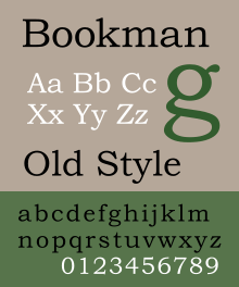
| Shown here | Bookman Oldstyle by Monotype Imaging |
Bookman or Bookman Old Style is a serif typeface. It is derived from the design Old Style Antique, created by Alexander Phemister around 1858 the Miller & Richard foundry.[1]
Bookman (as it became) was designed as an alternative to Caslon, with a more even and regular structure. It maintains its legibility at small sizes, and has been used extensively for headlines and in advertising. It is particularly associated with the graphic design of the 1960s and 1970s, when revivals of it were very popular.[2]
History
Several American foundries copied the Miller and Richard design, including the Bruce Type Foundry of New York, and issued it under various names. In 1901, Bruce refitted their design, made a few other improvements, and rechristened it Bartlett Oldstyle. When Bruce was taken over by American Type Founders shortly thereafter, they changed the name to Bookman Oldstyle.
A tradition dating to the ATF version is that many releases do not have an italic, instead featuring an oblique in which the letters are simply slanted. Serif typefaces which use an oblique are now very rare but a number were developed in the nineteenth and early twentieth centuries. At the time of its creation, Bookman was part of a wide range of American revivals of the Caslon design concept, visible in the wide-spreading arms of the T and the sharp half-arrow serifs on many letters; Ronaldson Old Style by Alexander Kay (1884) was another.[3] In 1936, Chauncey H. Griffith of the American Linotype foundry developed a revival, and Monotype also offered one.[4][5] (Linotype's has been digitised in its period form, making it one of the few digital versions not based on post-war versions.[6])
Many Bookman revivals appeared in the 1960s and 1970s, often adding an extensive repertoire of swash characters, meaning that the design is commonly associated with the graphic design of the period.[2] These large character repertoires took advantage of the new phototypesetting technology, which allowed characters to be stored on film or glass phototype master disks, rather than bulky metal type.[7] Letraset's is one of the revivals of this period.[8]
Mark Simonson, who has designed a revival of the Bookmans of this period, has commented:
I have so far been unable to find out who designed and produced [the original]. I think of it as the “Sixties Bookman.”...It’s closest to the larger sizes of ATF Bookman Oldstyle, but significantly bolder, with more contrast between the thicks and thins than other Bookmans and with smaller serifs...I’ve yet to see a credit for the designer or maker of this version. The best theory I have is that it was a custom font created for an ad campaign in the mid-sixties. Someone who had access to it made copies. And before long, every typesetting shop had it. Whatever the story is, this version of Bookman was everywhere. I had Sixties Bookman on rub-down type sheets when I was in high school in the early Seventies discovering type.[9]
One of the most famous results of this period is the 1975 ITC's revival from which many modern versions are descended.
Typographer Matthew Butterick has written that as a result of its use in this period Bookman 'evokes the Ford administration. If fonts were clothing, this would be the corduroy suit.'[2]
ITC Bookman
ITC Bookman is a revival designed by Ed Benguiat in 1975, for the International Typeface Corporation. Benguiat developed a full family of four weights plus complementary cursive designs. Benguiat also drew a suite of swash and alternate characters for each of the members of the family. This version adds a large x-height and moderate stroke contrast to improve legibility. The high x-height (tall lower-case letters) was a common feature of ITC revivals and of 1970s graphic design generally.
Fonts for swash and alternate characters were eventually released in OpenType versions of the fonts,[10] or separately as ITC Bookman Swash.
ITC licensed the design to Adobe and Apple, guaranteeing its importance in digital printing by making it one of the core fonts of the PostScript page description language as part of the Adobe PostScript 3 Font Set.[9] (The weights licensed were Light, Light Italic, Demi, Demi Italic.)
Derivatives of the ITC design
To provide compatibility with the Postscript standard, many modern Bookman revivals and variants have been designed to harmonise with the ITC version, or copy it due to its popularity. These include 'Revival 711' by Bitstream, and 'BM' by Itek.
URW++ donated their version, known as URW Bookman L, to the Ghostscript project as a free software replacement for the ITC version. It was further enhanced by the Polish GUST foundry as part of their TeX Gyre project and named Bonum.[11][12]
Most digitisations of Bookman are based on the Bookman revivals of the 1960s and 1970s. An exception is Bitstream's digitisation of the Linotype Bookman of the 1930s.[6]
Monotype version

The current Monotype version of Bookman is called Monotype Bookman Old Style or marketed as Bookman Old Style. It was designed by Ong Chong Wah. It is based on earlier Lanston Monotype and ATF models, but again was redesigned to match the ITC version. It is bundled with many Microsoft products, making it one of the most commonly used versions of Bookman.[13]
In Monotype Bookman the italic was redrawn following the style of the Old style Antique italics of Miller and Richard, but also incorporates the italic features from ITC Bookman. Though the face's name includes the phrase 'Old Style,' the near-vertical stress of the face places it more in the transitional classification. This version include support of Cyrillic, Greek, and extended Latin characters.
It was bundled with Microsoft Office products since version 4.3, except in Windows 7 Starter, and in TrueType Font Pack. Retail version of the font was released in 2005 via Linotype.

Jukebox Bookman
It is a revival of the original Bookman family by Alexander C. Phemister and Chauncey H. Griffith, designed by Jason Walcott and published by Veer.[14]
This family includes 6 fonts, with complementary italic, and 2 swash designs for each of the roman and italic fonts.
Bookmania (2011)
It is a revival of Bookman Oldstyle and the Bookmans of the 1960s, designed by Mark Simonson of Mark Simonson Studio. The design was started from a custom font designed by Mark Simonson back in 2006, which was based on Bookman Bold Italic with Swash, and a Bookman Bold with Swash font designed by Miller & Richard (as credited by Letraset). The italic fonts were redesigned to include optical correction. Unlike the ITC and Monotype revivals, Simonson chose to use the obliques preferred by ATF, offering true italic characters as an alternate.
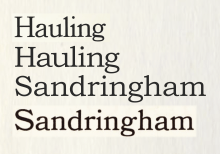
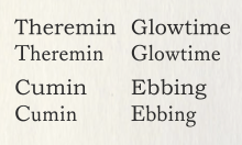
This family includes 10 fonts in 5 weights, each with complementary oblique. OpenType features include small caps, 680 swash characters, 35 optional (discretionary) ligatures, lining and old style figures (both proportional and tabular), full f-ligature set, alternate characters, automatic fractions, automatic ordinals, 6 stylistic sets (Cursive Forms, Roman/Italic Alternates, Commoncase Caps, Jenson 'e', Traditional Old Style Figure One, Wavy Crossbars).
References
- ↑ Neil Macmillan (2006). An A-Z of type designers. Yale University Press. p. 146. ISBN 0-300-11151-7. Retrieved 2009-08-21.
- 1 2 3 Butterick, Matthew. "Bad Fonts". Practical Typography. Retrieved 29 October 2015.
- ↑ "Ronaldson Old Style". MyFonts. Canada Type. Retrieved 27 November 2015.
- ↑ "Lanston Monotype Bookman specimen" (PDF). Retrieved 27 November 2015.
- ↑ "Lanston Monotype Bookman specimen b" (PDF). Retrieved 27 November 2015.
- 1 2 "Bookman Linotype/Bitstream". MyFonts. Bitstream. Retrieved 27 November 2015.
- ↑ Lurie-Terrell, Joshua. "Famous Manwich Recipes 1971". Fonts In Use. Retrieved 27 November 2015.
- ↑ Priddey, Neil. "An Old Raincoat Won't Ever Let You Down by Rod Stewart". Fonts In Use. Retrieved 27 November 2015.
- 1 2 Simonson, Mark. "Bookmania specimen pdf". Mark Simonson Studio. Retrieved 27 November 2015.
- ↑ What's Hot From ITC: January 2006
- ↑ "URW font ttf conversions". Ghostscript. Retrieved 22 September 2015.
- ↑ http://www.gust.org.pl/projects/e-foundry/tex-gyre/
- ↑ Simonson, Mark. "Monotype's Other Arials". marksimonson.com. Retrieved 21 August 2014.
- ↑ "Jukebox Bookman". MyFonts. Retrieved 27 November 2015.
External links
| Wikimedia Commons has media related to Bookman. |
- ATF's 1912 specimen book. Many sample settings including ads and newspaper designs.
- ATF's 1923 specimen book, their legendary last major specimen before the Depression.
- Bookman JF
- Bookmania
- ITC Bookman by Adobe Font Family - by Edward Benguiat
- ITC Bookman/ITC Tabula
- Microsoft Typography page
- MyFonts
- Re: Type factoids
- TeX Gyre Bonum, variant based on URW bookman L
- Typowiki
- Early Monotype Bookman metal type specimen - completely unlike modern Monotype Bookman which copies aspects of the ITC Bookman design.
