Excelsior (typeface)
 | |
| Category | Serif |
|---|---|
| Classification | Modern, slab-serif |
| Designer(s) | Chauncey H. Griffith |
| Foundry | Mergenthaler Linotype Company |
| Date released | 1931 |
| Design based on | Ionic No. 5 |
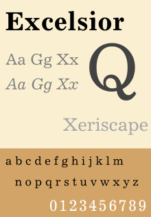
Excelsior is a slab serif typeface designed by Chauncey H. Griffith and presented by Mergenthaler Linotype in 1931. It is one of five typefaces in Griffith's 'Legibility Group' which contains typefaces especially suited to newsprint.[1]
Before designing this font, Griffith consulted the results of a survey of optometrists regarding optimal legibility. The design has similarities to Clarendon and Ionic slab-serif designs of the 19th century, most visibly in its regular weight. Ionic designs such as Excelsior were an influence on Times New Roman, particularly in its bold styles.[2][3]
Not particularly condensed, unlike many other newspaper typefaces, Linotype has described its usage as most common "in Europe, where newspaper columns are wide."[4][5]
Related typefaces Opticon and Paragon were released in 1935 as slightly heavier and slightly lighter versions of Excelsior designed for newspapers that deliberately underink to favor halftones, or overink to favor text and headlines. Ionic No. 5 is another version in the same group.
References
- ↑ The Legibility of Type. Brooklyn: Mergenthaler Linotype Company. 1935. Retrieved 29 April 2016.
- ↑ Lawson, Alexander (1990). Anatomy of a Typeface. New York: David R. Godine. pp. 270–294. ISBN 9780879233334. Retrieved 6 March 2016.
- ↑ Coles, Stephen. "Times Bold Modified". Flickr. Retrieved 26 January 2016.
- ↑ Linotype. "Excelsior". MyFonts. Retrieved 23 May 2015.
- ↑ Schwemer-Scheddin, Yvonne. "Reputations: Adrian Frutiger". Eye. Retrieved 12 September 2015.
- Consuegra, David. American Type Design & Designers. Allworth Communications, Inc.: 2004. ISBN 1-58115-320-1, ISBN 978-1-58115-320-0
- Hutt, Allen. Changing Newspaper: Typographic Trends in Britain and America 1622–1972. Gordon Fraser.: 1973. ISBN 0-900406-22-4, ISBN 978-0-900406-22-5
- Macmillan, Neil. An A-Z of Type Designers. Yale University Press.: 2006. ISBN 0-300-11151-7, ISBN 978-0-300-11151-4
- Miklavčič, Mitja (2006). Three chapters in the development of clarendon /ionic typefaces (PDF) (Thesis). University of Reading. Archived from the original (PDF) on November 25, 2011. Retrieved 6 October 2014.
